16.04.20 - 17.07.20 (Week 1 - Week 14)
Tamara Audrey Saputra (0335846)
Application Design II
Final Project
Instruction
Final Project
Week 1
Week 2 - Week 3
I changed some of the colors and added decorations to make the layout less dull.
Below is the XD link of the revised app design:
Week 6
For the final, we were told that we don't need to make all of the screens but instead take those that share the same layout as or represent the remaining screens.
Below are the chosen layouts that basically represent the rest of the screens:
 |
| fig 1: Page layout |
Week 9 - Week 14
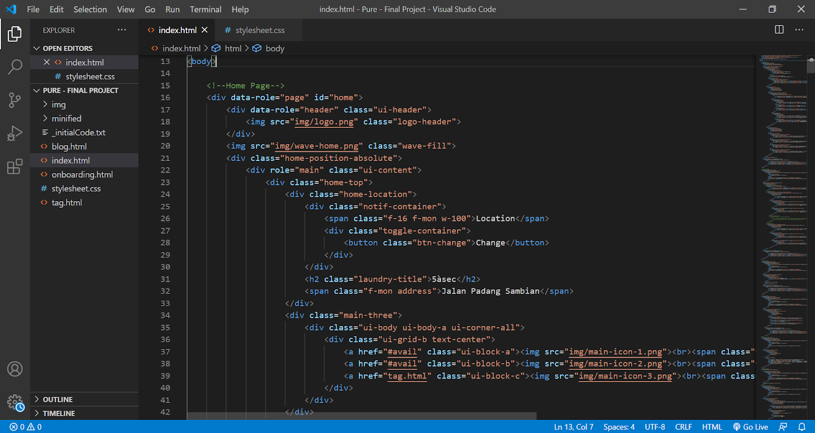
After I know which pages I'll have to make, I then focus on coding the app in Visual Studio Code since I don't have Dreamweaver.
 |
| fig 2: HTML Code |
 |
| fig 3: CSS Code |
After finishing all of the HTML and CSS, I then start to animate the app using the Green Sock.
 |
| fig 4: Animation Script |
Here is the preview of how it looked like when I view it on the browser with iPhone X resolution:
 |
| fig 5: Preview on browser |
Below are the screenshots of the pages in details:
Splash Screen & Onboarding Pages
 |
| fig 6: Splash screen |
 |
| fig 7: Onboarding screen |
 |
| fig 8: Onboarding screen |
 |
| fig 9: Onboarding screen |
Registration & Login Page
 |
| fig 10: Register page |
 |
| fig 11: Login page |
 |
| fig 12: Form page |
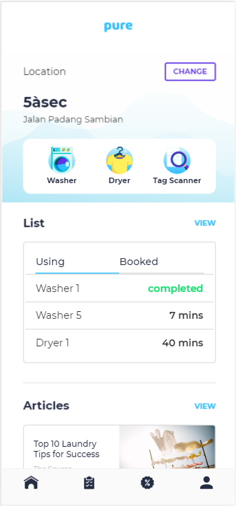
Home Page
 |
| fig 13: Home page |
Watchlist Page
 |
| fig 14: Watchlist page |
 |
| fig 15: Watchlist page |
Rewards Page
 |
| fig 16: Rewards page |
 |
| fig 17: Rewards page |
Account Page
 |
| fig 18: Account page |
 |
| fig 19: Account info page |
 |
| fig 20: Account notification page |
Availability Page
 |
| fig 21: Availability page |
 |
| fig 22: Availability page |
Use Now Page
 |
| fig 23: Use now page |
Use Later Page
 |
| fig 24: Use later page |
Payment Page
 |
| fig 25: Payment |
 |
| fig 26: Payment completed |
Timer Page
 |
| fig 27: Timer page |
Blog Page
 |
| fig 28: Blog page |
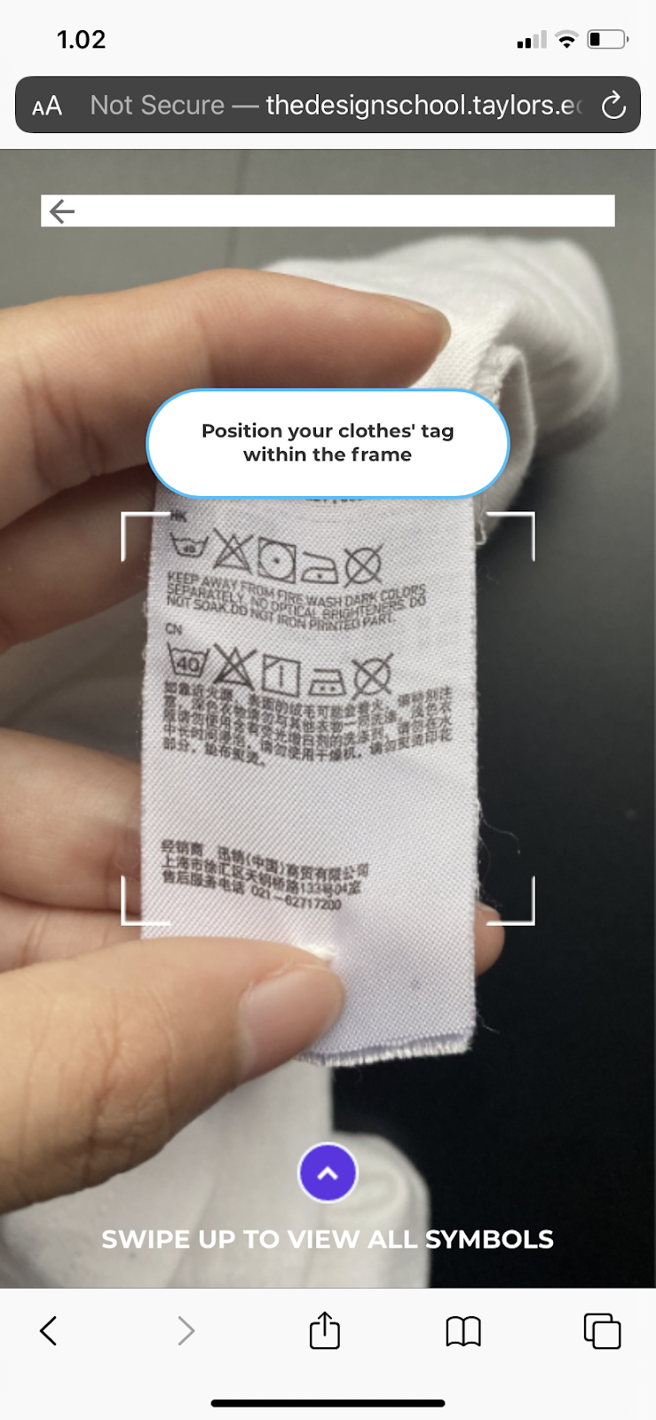
Tag Page
 |
| fig 29: Tag label page |
I then went back to my codes and adjusted some of the layout positionings as some of the elements shifted. Such as adjusting the width, height, adding margin, and re-structuring the codes.
Final Outcome
Below is the video walkthrough of the app when I open it from my phone with the adjusted resolution for iPhone 6/7/8 Plus:
Reflection
After completing and reviewing my work, I do realize that there are minor details that would be much better if it would be fixed and adjusted and that this is far from being totally complete. For example, like the vertical scrolling on pages that should have fit exactly to the screen height. I would have to look further into the problem as based on the preview on the browser, it perfectly fits the height. However, due to the time constraint, the ideal version as to how I intended it to be could not be achieved. On the other hand, throughout this module, it was fun to learn new things especially the animation part and it was nice to be introduced to Jquery mobile as before I was too comfortable with Bootstrap only.


Comments
Post a Comment