Tamara Audrey Saputra (0335846)
Advanced Typography
Final Compilation & Reflection
Instruction
Submissions
Typographic System
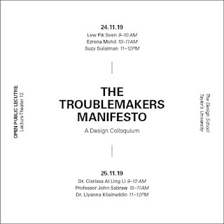
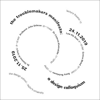
Project 1 - Troublemakers Manifesto (Key Artwork & Title)
 |
| fig 4.1 - Key Artwork Final |
Project 2 - Troublemakers Manifesto (Collateral)
 |
| fig 5.1: Poster |
 |
| fig 5.2: Tote Bag (Front) |
 |
| fig 5.3: Tote Bag (Back) |
 |
| fig 5.4: T-Shirt |
Final Project
 |
| fig 6.1: Roman Letters |
 |
| fig 6.2: Lota Script |
 |
| fig 6.3: Application |
 |
| fig 6.4: Application |
 |
| fig 6.5: Application |
 |
| fig 6.6: Application Mock-up |
Reflection
Experiences
Looking back, I remembered being rather anxious knowing that we'll be having another typography class, remembering how stressful it was in semester 1. Surprisingly, the class turns out to be much more exciting and interesting. Although, of course, there are days where you can feel the gloomy atmosphere of the class and how everyone looked so lifeless after going through rejections after rejections. But compared to last semester, most of us agreed that somehow this class is more enjoyable and fun. Maybe its because this time we have more freedom in what we want to make, allowing us to express ourselves better.
Observations
I noticed that this time the students are forced to be more proactive in class. By making the students do the presentation and explained it to the class instead of having the lecturers explained it to us like the previous semester's class. In this way, it encourages the students to look up and actually read more about the topic instead of just passively listening and not leave a great impression. I also notice that I started to integrate the things we learned such as the typographical system as well as the image and text interplay subconsciously in project 1 and project 2.
Findings
In this module, I learned that a good design has to not only be aesthetically pleasing but also meaningful and purposeful. When designing we should really consider the target audience and what underlying message do we want to convey to the audience. This allows us to become more critical towards our design and is also probably the most challenging part to overcome in this module. I feel that this whole experience gives us a rough idea of what to expect when we later decide to work in the creative industry, especially in the design field.


Comments
Post a Comment