Advance Typography - Project 2

21.05.19 - 28.05.19 (Week 8 - Week 9)
Tamara Audrey Saputra (0335846)
Advanced Typography
Project 2 - The Troublemakers Manifesto (Collateral)
Lectures
Lecture 8:
21.05.19 (Week 8)No lecture.
Lecture 9:
28.05.19 (Week 9)No lecture, but, at the end of the class Mr. Vinod briefed us about our Final
Instruction
Project 2 - The Troublemakers Manifesto (Collateral)
Collateral Development | Week 8 - 9
Poster
After getting my key artwork approved, I proceed to my poster. Below is the process of it.
 |
| fig 1.1: Poster process |
 |
| fig 1.2: First Attempt |
Feedback: Mr. Vinod suggested to play more with the content placement instead of placing it all at the bottom as it overstabilized the composition.
Final Result
 |
| fig 1.3: Poster - Final Result |
 |
| fig 1.4: Printed 50X70 |
Tote Bag
 |
| fig 2.1: Design Process |
I attempted several compositions for the tote bag design.


fig 2.2: Tote Bag Design attempts
Final Result
 |
| fig 2.3: Tote Bag - Final Result (Front) |
 |
| fig 2.4: Tote Bag - Final Result (Back) |
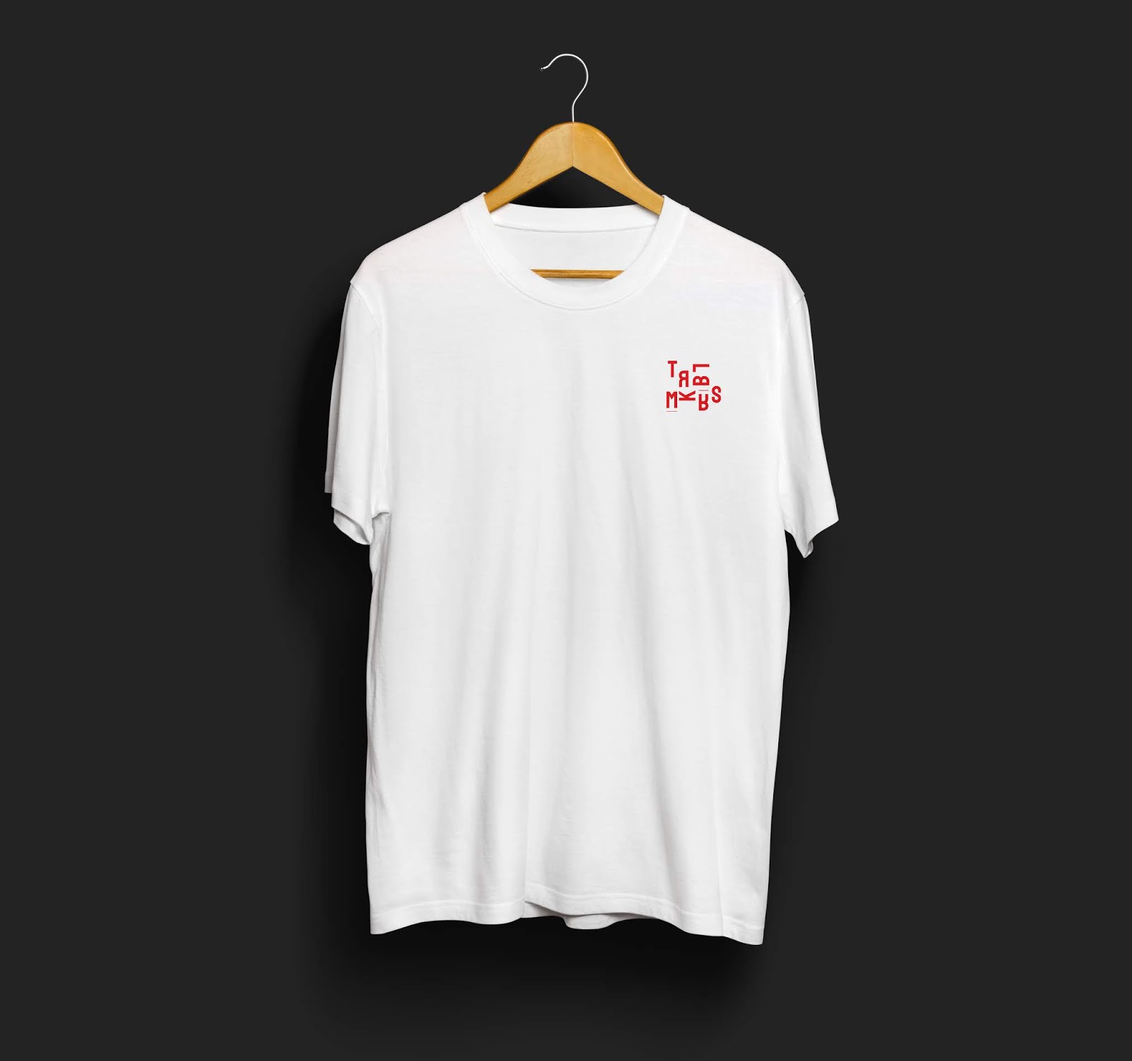
T-Shirt
I also downloaded the t-shirt mockup first and then edit it with Photoshop to insert my key artwork. |
| fig 3.1: Design Process |
Final Result
Here are several designs I made for the T-Shirt.


 |
fig 3.2: T-shirt - Final Result
Flat Lay
 |
| fig 3.3: Flat Lay |
Feedbacks
Week 8
Specific Feedback:
In my key artwork's initial attempts, Mr. Shamsul told me there weren't enough interplay and the background should preferably be left white. After viewing my other attempt, Mr. Shamsul said it's much better. Mr. Vinod also said that the typography of it is nice and I could add other small graphics elements to complement it. Meanwhile, for the poster, Mr. Vinod suggested to play more with the content placement instead of placing it all at the bottom as it overstabilized the composition. I was then suggested to proceed with my collateral design.
Week 9
(Online) Mr. Vinod: Where's the word Manifesto? The colloquium is called: "Troublemakers Manifesto". Nice adaptation. Keep at it.
Meanwhile, in class, the response from both Mr. Shamsul and Mr. Vinod regarding the t-shirt and tote bag was positive and great. They said they liked the adaptation of the "Troublemakers" in the final result.
Reflection
Experiences
Week 8
The class was rather tiring as we have to keep refining our key artwork but also have to finish our poster on the same day. During the last 3 hours before the class ends, we could actually feel the class atmosphere was getting gloomy.
Week 9
This week was much nicer than last week's as I managed to somehow get my work approved much faster than before. Overall, it was great.
Observations
Week 8
I realized that many of us, including me, was struggling to convey the message behind the term "Troublemakers Manifesto" as it's obvious but also at the same time rather vague. Hence, choosing the right semiotic was challenging.
Week 9
I noticed many people use red color accompanied by a gas mask as well to represent the term "Troublemakers". It's interesting as it reflects how people perceived the word similarly by using red to indicate the braveness and the gas mask to represent the rebellious side.
Findings
Week 8
The brief regarding that the collateral needs to be different and not a copy and paste of the key artwork have forced myself to explore the composition further based on the medium it will be printed on. It also made me realize that designers tend to play with around with colours and composition for their collaterals.
Week 9
I get to understand deeper about the concept of "Less is More" as I often found myself reducing the amount of elements used and focusing on the composition of the objects I already have. Refraining myself from adding more objects as it might clutter the composition.
Further Readings
Design School Type: A Practical Guide for Students and Designers

Chapter 6: Typography in Practice
This section of the book exposed us to the works of both students and leading graphic designers from around the world which allows us to examine how they have applied the fundamental principles of type to their work. The book hopes that these visual references can later help novice practitioners to explore new concepts and achieve greater power. Below are some of the pages of this section.


Comments
Post a Comment