Advance Typography - Final Project
04.06.19 - 25.06.19 (Week 10 - Week 13)
Tamara Audrey Saputra (0335846)
Advanced Typography
Final Project - Design Exploration and Application
Instruction
Final Project - Design Exploration & Application
Brainstorming & Idea Proposal | Week 10
Idea #1
Idea: My initial idea was to create an installation in letterforms which visually gives off an illusion that it is levitating and scattered.
Purpose: Deriving from that idea, I thought about raising awareness regarding Alzheimer's disease.
Below are the references I found for the idea:
Purpose: Deriving from that idea, I thought about raising awareness regarding Alzheimer's disease.
Below are the references I found for the idea:
Fig 1.1: References
Idea #2
I then look for other ideas that could have more purpose since I found finding the purpose of the idea is much harder than coming up with experimental ideas.
Mr. Vinod then approved the second idea and suggested me to make the roman letters as well as the local script. He told me to look at the Baloo Typeface in Google Fonts as reference.
Designing | Week 11
The Roman Letters
I started out by sketching the roman letters out on a graph paper by keep referring back to the journals that I found to see what elements or characteristics of it that I could implement to the roman letters.
I then scan and digitize it in Illustrator.
 |
| Fig 2.2.1: Process in Illustrator |
 |
| Fig 2.2.2: 1st Attempt |
When I showed the 1st attempt Mr. Vinod & Mr. Shamsul suggested me to make some changes to the letters. Such as how the "W", "M", "V", & "A" has a sharp edge that doesn't get along with the other letters and the "U" & "V" should also be adjusted more to make it easier to differentiate between them.
 |
| Fig 2.2.3: Changes Made to "W" & "M" |
After showing the second attempt of the "M" & "W", he suggested me to make the letters in a minimalistic way as shown above.
 |
| Fig 2.2.4: Changes Made to "U" & "V" |
Mr. Vinod also pointed out how the "X" & Y" does not have contrast like the other letters.
 |
| Fig 2.2.5: Changes Made to "X" & "Y" |
 |
| Fig 2.2.6: 2nd Attempt |
After assembling all the letters together, I feel that I did the decoration too much and making it too bulky. Hence, I decided to simplify it after seeing the "M" & "W".
 |
| Fig 2.2.7: Final Attempt |
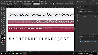
The Lota Script
After finishing the alphabets, I proceed to do the script by using the elements that are used to make letters in order to retain the alikeness.
 |
| Fig 3.1.1: Process in Illustrator |
 |
| Fig 3.1.2: Process in Illustrator |
 |
| Fig 3.1.3: 1st Attempt |
I showed the script along with the letters to Mr. Vinod. He said that the roman letters are good but the script doesn't seem to look right and more work should be done. He encouraged me to introduce slight curves to it and also to not make it too similar with the roman letters as it's difficult to differentiate when but side-by-side as seen below.
Fig 3.1.4: Comparing the script with the roman letters.
I then feel the need to re-study the script again. I looked up to the Buginese script already done by another designer and studied the height and width used in their work.
 |
| Fig 3.2.1: Study of the Buginese script. |
 |
| Fig 3.2.3: 2nd Attempt |
 |
| Fig 3.2.4: Comparing script 2nd attempt to roman letters. |
Application
For the application, I decided to make a tourism ad for the destinations in Flores as well as the culture they have.
 |
| fig 4.1.1: Application first attempt |
 |
| fig 4.1.2: Application first attempt |
 |
| fig 4.1.3: Application first attempt |
Mr. Vinod suggested me to makes all of the background color similar to maintain its identity. He also said to try to play more with the text layout.
 |
| fig 4.1.4: Application |
 |
| fig 4.1.5: Application |
 |
| fig 4.1.6: Application |
 |
| fig 4.1.7: Application Mock-Up |
Feedbacks
Week 11
Specific Feedback:
I proposed my idea of creating a typeface adapted from an Ende (Flores, Indonesia) language called Lota with an intention to preserve it as the language is dying. Mr. Vinod told me to look up for examples and references and showed me the Baloo typeface to analyze other designers' adaptation.
I proposed my idea of creating a typeface adapted from an Ende (Flores, Indonesia) language called Lota with an intention to preserve it as the language is dying. Mr. Vinod told me to look up for examples and references and showed me the Baloo typeface to analyze other designers' adaptation.
Week 12
Mr. Vinod said that my references are great and I'm on the right track, however, I should progress faster. He also pointed out some of the main characteristics of the Lota characters that could be included in the letters. e.g sharp edges, some curves, dots, and double lines.
Week 13
Specific Feedback:When I showed the 1st attempt Mr. Vinod & Mr. Shamsul suggested me to make some changes to the letters. Such as how the "W", "M", "V", & "A" has a sharp edge that doesn't get along with the other letters and the "U" & "V" should also be adjusted more to make it easier to differentiate between them. Mr. Vinod also pointed out how the "X" & Y" does not have contrast like the other letters.
Online Feedback:
"The roman is good. The script doesn’t seem to look right." "Tamara I think more work necessary with the local script. Don’t be afraid to introduce slight curves. And don’t try to match is completely with the roman letters. Difficult to differentiate." "By itself it looks ok. Use it together with a roman script and in your application and see how that goes."
"The roman is good. The script doesn’t seem to look right." "Tamara I think more work necessary with the local script. Don’t be afraid to introduce slight curves. And don’t try to match is completely with the roman letters. Difficult to differentiate." "By itself it looks ok. Use it together with a roman script and in your application and see how that goes."
Reflection
Experiences
Week 11
It was really hard to find the right topic as it has to have a purpose and solves something. In addition, there was also an urge to want to do different things than what others are doing which takes up much more time to decide a topic.
Week 12
It was challenging to fuse the script's characteristics to the roman letters without making it ending up looking like Greek letters due to the sharp edges it shares. I also find it too decorative and have to immensely cut down many stuff to make it look simpler.
Week 13
When I did the script, It took me a while to figure out how to correctly incorporate the contrasting strokes without making it look heavy on one side or imbalance while ensuring the stroke's direction is consistent.
Observations
Week 11
I realize that many of my friends are struggling with a similar problem when trying to figure out what topic they are going to do.
Week 12
I realize that many of my friends decided to look back to their roots and take ideas from their local culture.
Week 13
I realized that by studying an existing typeface really helps a lot to better understand how the design is done. Especially, when dealing with scripts that I'm very not familiar with.
Findings
Week 11
I found out that Indonesia has so many different types of scripts that are also very contrasting to one another due to different roots. Such as the script that I decided to create, Lota-Ende script, I didn't know it existed until I searched about the variety of scripts in Indonesia.
Week 12
When making the roman letters, I found out that there are several shapes of the letters that can't be altered much in order to avoid people from misidentifying the letters.
Week 13
I found out about that by adjusting the x-height and width of the scripts allows for better readability. I realized this after adjusting the first attempt and attempting to refine it by reducing its x-height and allow more flexibility for its width. In addition, I believe by introducing slight curves have also improved the readability a lot.
Further Readings
Creating Your Type's DNA: Capital Letters
http://designwithfontforge.com/en-US/Capital_Letters.html
I found an article on the web which covers the topic of how to establish the DNA of the typeface when making one. In order to maintain a consistent look throughout all of the 16 alphabets. The article consists of two parts; the lowercases and the uppercases. I decided to focus more on the capital letters as it relates more to my current project.
The article suggested to start of by designing the letter 'H' and 'O' as it not only relates to the other capital letters but also to the small letters. The 'H' could help determine how the left side of 'B', 'D', 'E', 'F', 'K', 'L', 'P', 'R' as well as the shape of 'I' and 'J'. Meanwhile, 'O' could tell us a lot about the shape of 'C', 'G' and 'Q'. The article also explained that in capital letters there will be more variety in terms of the letters' width compared to small letters.


Comments
Post a Comment