Interactive Design - Exercises

05.04.19 - 02.07.19 (Week 1 - Week 14)
Tamara Audrey Saputra (0335846)
Interactive Design
Exercises
Lecture
Lecture 1: Introduction to Interactive Design
04.04.19 (Week 1)On our first class, Mr. Shamsul introduced us to the MIB and what this module is about. He also briefed us about the software and framework we are going to use.
Lecture 2: User Interface Design
11.04.19 (Week 2)In this class, we were explained how UI is different from UX and what should we keep in mind when it comes to designing for users.
Instruction
6 Good & Bad Websites | Week 1
02.04.19
We are divided into several groups and are assigned a task to find 6 good & 6 bad websites from https://www.webbyawards.com/ and https://www.thebestdesigns.com/. The judgment must be made based on the usability, accessibility, layout as well as the visual aesthetic of it.
Good Websites
 |
| Fig 1.1: https://elizabethtaylor.com/ |
 |
| Fig 1.2: https://www.coachella.com/youtube-music/ |
 |
| Fig 1.3: https://imagine-entertainment.com |
 |
| Fig 1.4: https://forwardyou.com/en |
 |
| Fig 1.5: http://interactive.unwomen.org/multimedia/infostory/justicenow/en/index.html |
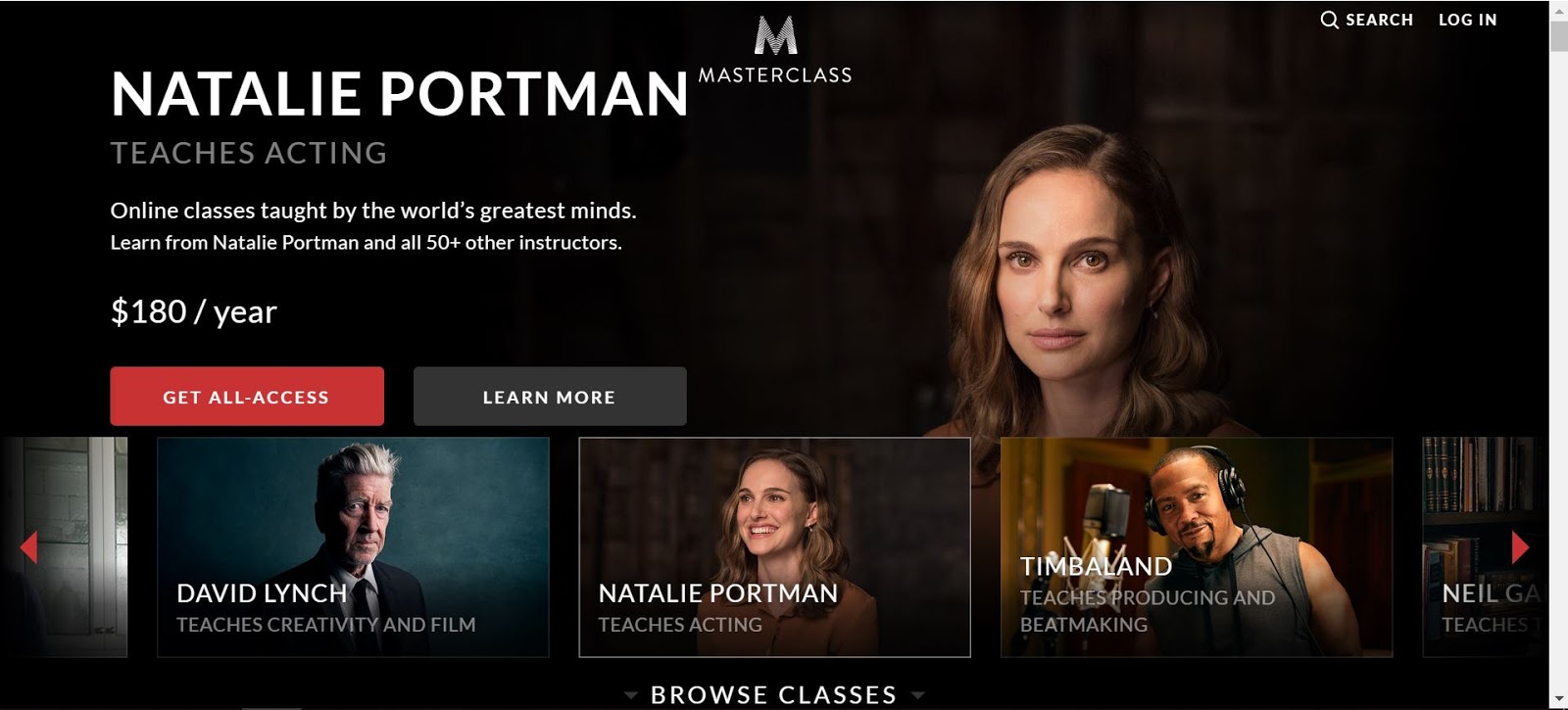 |
| Fig 1.6: https://www.masterclass.com/ |
Bad Websites
 |
| Fig 1.7: https://www.pillandpillow.com/vhk/site/ |
 |
| Fig 1.8: https://merch.gunsberg.in |
 |
| Fig 1.9: http://www.11coffee.co.uk/ |
 |
| Fig 1.10: https://loveiko.com/delo |
 |
| Fig 1.11: https://www.nasa.gov/topics/moon-to-mars |
 |
| Fig 1.12: https://get.smoooth.com/uk/ |
Surveying the Possibilities
Taylor's University Interactive Information Kiosk | Week 2
11.04.19
In this exercise, we are again divided into groups and are assigned a task to design an information kiosk for Taylor's University with 1 main purpose in mind. The group is then divided into 2 sub-groups: Information & Design. I was in the design part.
This is the information gathered by the Information team.
 |
| Fig 2.1: The information outline |
The followings are the sketches made initially:
 |
| Fig 2.2: Sketch |
 |
| Fig 2.3: Sketch |
Final Result
 |
| Fig 2.4: Page 1 |
 |
| Fig 2.5: Page 2 |
 |
| Fig 2.6: Page 3 |
 |
| Fig 2.7: Page 4 |
 |
| Fig 2.8: Page 5 |
 |
| Fig 2.7: Page 6 |
Introduction to HTML | Week 4
25.04.19
In this week's class, we were introduced to the basics of HTML. By directly trying it out in Notepad. This exercise aims to familiarize us with the HTML basic structure and code tags.
In this exercise, we should include the use of unordered/ordered list as well as an image and 2 paragraphs about ourselves.
Below is the process of it:
 |
| fig 3.1: HTML in Notepad |
 |
| fig 3.2: Result |
HTML Exercise 2 | Week 5
02.05.19
This exercise is not much different than the previous HTML exercise done last week. We were however introduced to a technique where when a link, preferably in the navigation bar, is clicked it will direct us instantly to the assigned/declared section within the page by using the id attribute.
The content should be long enough for the technique to be seen. Hence, we were required to write at least 4 sections with a minimum of 2 paragraphs each. It should also include images, list, and last but not least a link that will bring the user back to the top of the page.
Below is the process of creating it done in Notepad:
 |
| fig 4.1: HTML in Notepad |
 |
| fig 4.2: Result |
Here is the link to the page: https://trusting-kare-cd0474.netlify.com/
HTML & CSS | Week 6
09.05.19
In this week's exercise, we are further introduced to the basics of HTML and CSS. The exercise requires us to stylized our previous exercise using CSS. We were also taught on how to include scroll-behavior, background image, hover effect as well as margins for the content width.
Below is some of the CSS coding done in Dreamweaver CC.
 |
| fig 5.1: CSS in Dreamweaver |
Here is the link to the stylized page: https://hungry-kowalevski-f6bace.netlify.com/
Layout Exercise | Week 7 - 8
16.05.19 - 23.05.19
In this week's exercise, we are expected to create a layout of the given content by using HTML and CSS in Dreamweaver.
The instruction and content of the page can be viewed here:
https://drive.google.com/open?id=1a37dgyPJnwv92zbRJzvm4T4aGFWNWhmG
To have a rough I idea, I first made the layout in Photoshop.
 |
| fig 6.1: Rough Layout |
The following images are the HTML and CSS document done in Dreamweaver.
 |
| fig 6.2: HTML Code |
 |
| fig 6.3: CSS Code |
Here is the link to the page: https://dazzling-heisenberg-0b554d.netlify.com/
Feedback: Mr. Shamsul suggested to change the 4th Section background color to a darker shade as white is too contrast. He also suggested giving more space within the footer as it feels a bit too narrow.
Below is the revised version of it:
Link: https://jovial-fermi-844105.netlify.com/
Further Readings
The Usability of Carousel Design
Source: https://uxplanet.org/the-usability-of-carousel-design-4e3930a10b29

With the popularity use of hero carousel in web design due to its ability to display more than one content in the same place, once at a time. The writer discusses how the usability of carousel can be improved.
- The content sequence should be followed by importance.
- Keep a small amount of text in each frame.
- Ensure accessibility by providing "next" and "previous" buttons.
- Provide more than one clue for control, and indicate how many frames in your carousel and which frame is displayed.
- Ensure the controls appear within the carousel.
- Continue cycling.
- Support swipe gesture on mobile.
The writer also mentions that some people may simply ignore large images as they are seen unimportant and are commonly associated with ads. "From the eye-tracking experiment, we know people have banner blindness. They are more likely to ignore these large images and miss all the content on them."
The writer also mentions that some people may simply ignore large images as they are seen unimportant and are commonly associated with ads. "From the eye-tracking experiment, we know people have banner blindness. They are more likely to ignore these large images and miss all the content on them."
The Psychology Principles Every UI/UX Designer Needs to Know
Source: https://uxplanet.org/the-psychology-principles-every-ui-ux-designer-needs-to-know-24116fd65778


Comments
Post a Comment